
Goldenoak Developers
Goldenoak Developers LLP is a premium real estate developer focused on creating modern commercial spaces with strong investment potential and long-term value.

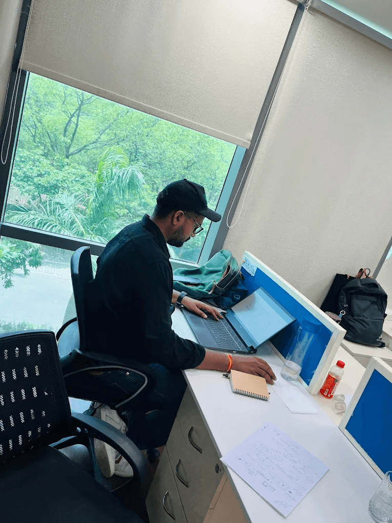
Frontend Team · UI & Interactions
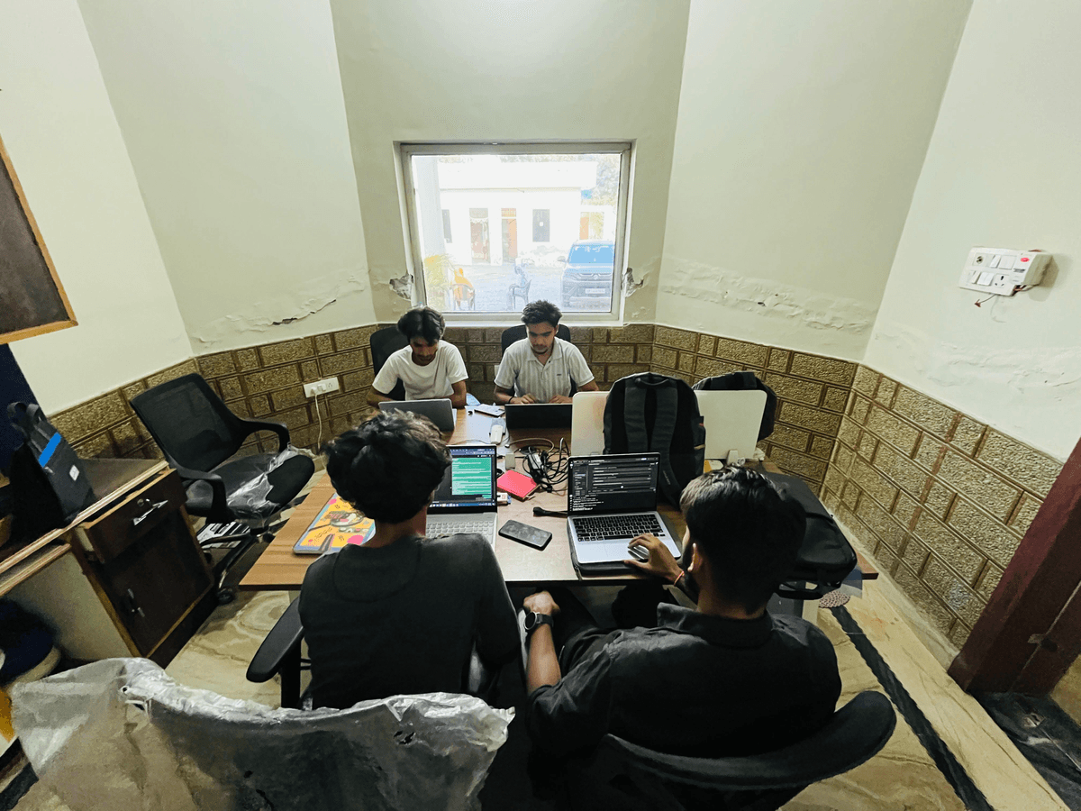
Backend Team · APIs & Infrastructure
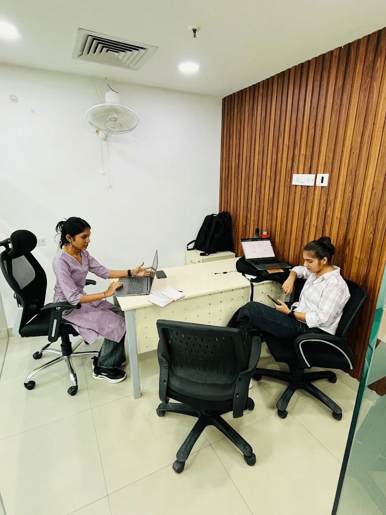
Design Team · UX & Visual Design

Desktop - 2.png

unnamed 1.png

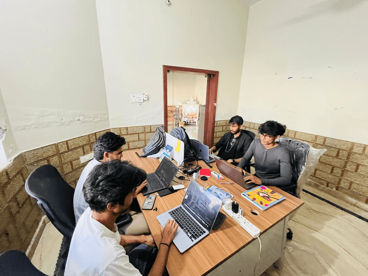
DevOps Team · CI/CD & Deployment

QA Team · Testing & Quality
Goldenoak Developers

this crew shipped Goldenoak Developers in 10 weeks


Goldenoak Developers LLP is a premium real estate developer focused on creating modern commercial spaces with strong investment potential and long-term value.
Goldenoak Developers LLP is a premium real estate developer focused on creating modern commercial spaces with strong investment potential and long-term value.
Goldenoak Developers LLP is a forward-thinking real estate developer focused on delivering premium commercial and infrastructure projects across North India. With a strong emphasis on quality construction, strategic locations, and long-term value creation, the company aims to redefine modern real estate experiences for businesses, investors, and communities alike. Their portfolio reflects a balance of government infrastructure projects and high-potential commercial developments, positioning them as a credible and emerging name in the real estate sector.
Xenotix collaborated with Goldenoak Developers LLP to build a cohesive brand presence and elevate their market positioning. The objective was to create a unified identity that communicates trust, professionalism, and premium quality—while also appealing to modern investors and businesses. This involved developing brand communication, visual identity systems, and marketing collaterals that align with the company’s vision and growth ambitions.
One of the key challenges was to structure a brand narrative that effectively represents both the company’s legacy and its forward-looking approach. Goldenoak’s work spans diverse projects, including government developments such as police housing and institutional buildings, as well as private commercial spaces like high-street retail and mixed-use developments. Xenotix addressed this by crafting a clear and consistent communication framework that highlights credibility, experience, and a strong commitment to excellence.
From a design perspective, a premium and minimal visual language was adopted to position Goldenoak as a modern and reliable developer. Clean layouts, strong typography, and a refined color palette were used to ensure consistency across brochures, presentations, and digital assets. The design approach was inspired by global real estate standards, focusing on clarity, sophistication, and impact.
Content played a crucial role in shaping the brand’s perception. Messaging was carefully developed to emphasize Goldenoak’s strengths—timely delivery, strategic project selection, quality construction, and long-term investment value. The tone was kept professional yet aspirational, ensuring it resonates with a wide audience, including institutional partners, investors, and end-users.
In addition to branding, Xenotix supported the presentation of key projects, helping translate technical and architectural details into engaging, easy-to-understand formats. This allowed Goldenoak to better communicate the value of their developments and stand out in a competitive real estate market.
The outcome is a strong, consistent brand identity that reflects Goldenoak Developers LLP’s vision and capabilities. Through strategic design and communication, Xenotix helped position the company as a trusted developer capable of delivering high-quality projects with long-term value. This transformation not only enhances brand perception but also supports Goldenoak’s growth as it continues to expand its footprint in the commercial real estate sector.
CLIENT
Company
Goldenoak Developers
Industry
Real Estate
Location
Noida
Website
www.goldenoakindia.comType
UI/UX Design, Website
Goldenoak Developers LLP is an emerging real estate development firm based in North India, focused on delivering high-quality commercial and infrastructure projects. With a strong foundation built on reliability, execution capability, and a forward-looking mindset, the company is steadily positioning itself as a trusted name in the real estate sector. Goldenoak’s approach combines practical development expertise with a clear understanding of evolving market needs, enabling it to create spaces that are not only functional but also commercially viable and future-ready.
The company’s portfolio reflects a balanced mix of public and private sector projects. On one hand, Goldenoak has contributed to critical infrastructure developments such as police housing, municipal headquarters, and institutional facilities. These projects highlight the company’s ability to execute large-scale developments with precision, compliance, and accountability. On the other hand, Goldenoak is actively expanding into premium commercial real estate, focusing on high-street retail, mixed-use developments, and lifestyle-oriented spaces designed for modern urban users.
This dual experience provides Goldenoak with a unique advantage—combining the discipline and reliability of infrastructure development with the innovation and market responsiveness required in commercial real estate. The company’s developments are driven by a deep understanding of location dynamics, user behavior, and long-term investment potential. Rather than pursuing volume, Goldenoak emphasizes thoughtful project selection and strategic execution, ensuring that each development contributes meaningful value to its surroundings.
At its core, Goldenoak Developers LLP is committed to building with purpose. Every project is approached with a focus on quality construction, efficient planning, and long-term sustainability. The company prioritizes robust structural standards, well-planned layouts, and designs that enhance usability while maintaining aesthetic appeal. This commitment to quality not only strengthens the end-user experience but also reinforces investor confidence, making Goldenoak’s developments attractive from both functional and financial perspectives.
Transparency and trust are also central to the company’s ethos. Goldenoak operates with a strong emphasis on clear processes, timely delivery, and adherence to regulatory frameworks. By maintaining a disciplined approach to development, the company ensures that its projects meet expectations and deliver on their promised value. This reliability plays a crucial role in building long-term relationships with stakeholders, including investors, partners, and end-users.
As the real estate landscape continues to evolve, Goldenoak is focused on adapting to new opportunities and emerging trends. The company is actively exploring developments that integrate lifestyle, business, and investment into cohesive environments. By doing so, it aims to create destinations rather than standalone structures—spaces that attract people, drive engagement, and sustain long-term growth.
Goldenoak Developers LLP envisions becoming a leading name in premium commercial real estate by creating landmark developments that define the future of urban business and lifestyle environments. The company’s vision goes beyond constructing buildings; it is centered on shaping destinations that inspire growth, enable opportunities, and deliver lasting value to all stakeholders.
A key pillar of this vision is the focus on strategic location selection. Goldenoak believes that the success of any real estate development is deeply connected to its surroundings—its accessibility, connectivity, and future growth potential. By identifying high-potential micro-markets and emerging urban corridors, the company aims to position its developments in locations that naturally support commercial success and long-term appreciation. This strategic foresight allows Goldenoak to create projects that remain relevant and valuable even as market dynamics evolve.
Another important aspect of the company’s vision is design excellence. Goldenoak is committed to developing spaces that combine modern architecture with practical functionality. The goal is to create environments that are not only visually appealing but also efficient, adaptable, and aligned with the needs of contemporary users. Whether it is retail spaces designed for maximum visibility and footfall or studio suites tailored for modern lifestyles, every aspect of design is carefully considered to enhance user experience and operational performance.
Sustainability and long-term value creation are also integral to Goldenoak’s vision. The company aims to develop projects that are built to endure—both structurally and economically. This involves using quality materials, adopting efficient construction practices, and ensuring that developments are aligned with long-term urban growth patterns. By focusing on sustainability, Goldenoak seeks to create assets that continue to generate value over time, benefiting investors, businesses, and communities alike.
Goldenoak also recognizes the importance of creating integrated ecosystems within its developments. Modern real estate is no longer just about isolated spaces; it is about building environments where different elements—retail, business, lifestyle, and social experiences—come together seamlessly. The company’s vision includes creating such integrated destinations that encourage interaction, enhance convenience, and contribute to a vibrant urban experience.
From an investment perspective, Goldenoak aims to offer opportunities that are both secure and rewarding. The company understands the priorities of modern investors—stable returns, capital appreciation, and low-risk assets. By focusing on well-planned commercial developments in high-growth areas, Goldenoak seeks to deliver projects that meet these expectations while also providing long-term wealth creation potential.
Ultimately, Goldenoak Developers LLP’s vision is driven by a commitment to excellence, innovation, and responsibility. The company aspires to build a legacy of trust by consistently delivering projects that meet the highest standards of quality and performance. Through strategic planning, thoughtful design, and a customer-centric approach, Goldenoak aims to shape the future of commercial real estate—creating spaces that not only meet today’s needs but also anticipate tomorrow’s opportunities.
Desktop - 2.png
Goldenoak Developers LLP approached Xenotix with the need to establish a strong, premium, and cohesive brand presence in a highly competitive real estate market. While the company had a solid foundation in infrastructure and commercial development, its existing communication and presentation lacked the consistency, clarity, and visual impact required to position it as a modern, high-value developer.
The primary challenge was not the absence of capability, but the absence of a unified narrative. Goldenoak’s portfolio included a mix of government infrastructure projects and emerging commercial developments, but these were not being presented in a way that effectively communicated the company’s strengths, credibility, and future vision. As a result, there was a gap between the company’s actual potential and how it was perceived by investors, partners, and end-users.
Additionally, the launch of their upcoming commercial project, Sigma-3 Avenue, required a distinct yet aligned identity that could stand out in the crowded real estate landscape. The project needed to be positioned as a premium investment opportunity while still maintaining consistency with the parent brand. This created a dual-layered challenge—building a strong corporate identity while simultaneously crafting a compelling project-level narrative.
From a marketing perspective, the company required a complete transformation in how it communicated value. Traditional real estate messaging often focuses heavily on features and specifications, but modern buyers and investors are driven by experience, aspiration, and long-term potential. The task was to shift from generic communication to a more refined, strategic, and design-led storytelling approach that resonates with a premium audience.
One of the core challenges was the absence of a consistent and recognizable brand identity. Goldenoak’s communication across different touchpoints lacked uniformity in design, tone, and messaging. This inconsistency made it difficult to establish a strong brand recall and limited the company’s ability to stand out in a competitive market.
Xenotix needed to create a cohesive visual and verbal identity system that could be applied across brochures, presentations, and digital platforms. The challenge was to ensure that every piece of communication reflects the same level of quality, professionalism, and premium positioning.
Goldenoak’s experience in infrastructure and government projects added credibility, but it also created a perception challenge. The company needed to transition from being seen purely as an execution-focused developer to a brand that also represents innovation, design, and premium commercial development.
Balancing this dual identity—legacy credibility and modern aspiration—required careful storytelling. The communication had to highlight past achievements without appearing outdated, while also presenting a forward-looking vision that aligns with current market expectations.
The commercial real estate market, especially in regions like Greater Noida, is highly competitive, with multiple developers offering similar products. Differentiation becomes a key challenge in such an environment.
Sigma-3 Avenue needed to stand out not just in terms of features, but in perception. The challenge was to position the project as a premium, high-growth investment opportunity, even when competing projects might offer comparable specifications. This required a strong focus on branding, storytelling, and visual presentation.
Another major challenge was translating the project’s investment potential into clear, compelling communication. While factors like location, connectivity, and infrastructure growth are critical, they are often presented in a generic way across the industry.
The task was to present these elements in a way that feels insightful, credible, and aspirational. Investors needed to clearly understand why Sigma-3 Avenue is a strong opportunity, without overwhelming them with technical jargon or repetitive messaging.
In real estate marketing, there is often a tendency to overload brochures with information—features, specifications, plans, and technical details. However, premium real estate branding demands a more minimal, design-driven approach.
The challenge was to strike the right balance between information and aesthetics. The content needed to be concise yet impactful, while the design had to create a sense of luxury and clarity. This required careful content curation and layout planning to ensure that each page delivers a focused message without clutter.
To compete with top-tier developers, Goldenoak required a visual identity that reflects sophistication and exclusivity. This involved developing a design language that goes beyond standard templates and aligns with global real estate branding standards.
The challenge here was to create a visual system that feels premium yet accessible, modern yet timeless. Elements such as typography, color palette, spacing, and imagery had to work together seamlessly to create a strong and consistent visual experience.
Another critical challenge was maintaining consistency across all brand and project materials. From brochures and presentations to digital assets, every touchpoint needed to reflect the same identity and messaging.
Inconsistent communication can dilute brand perception, especially in a premium segment. Xenotix had to ensure that the developed system could be easily implemented across various formats while maintaining its integrity and impact.
Traditional real estate communication often focuses on selling units—highlighting sizes, prices, and specifications. However, modern buyers and investors are more interested in the overall experience, lifestyle, and long-term value.
The challenge was to shift the narrative from product-centric to experience-centric communication. Instead of just selling retail spaces or studio suites, the focus needed to be on creating a destination, a lifestyle, and an investment story.
In real estate, trust plays a crucial role in decision-making. For emerging developers like Goldenoak, establishing credibility through branding and communication is essential.
The challenge was to use design and content as tools to build trust—through clarity, professionalism, and attention to detail. Every element needed to reinforce the perception of reliability, quality, and long-term commitment.
The overall challenge was not just about designing a brochure or creating content—it was about transforming perception. Xenotix needed to bridge the gap between Goldenoak’s existing capabilities and its desired market positioning, creating a brand and project narrative that feels premium, cohesive, and future-ready.
By addressing these challenges through strategic design and communication, the foundation was set for a strong and differentiated presence in the commercial real estate market.
For Goldenoak Developers LLP, the objective was not just to design a brochure or create marketing assets—it was to build a cohesive brand ecosystem that could elevate perception, communicate value, and position the company confidently within the premium commercial real estate segment. At Xenotix, we approached this as a strategic transformation exercise, where design, content, and storytelling work together to create a unified and impactful brand experience.
Our methodology was structured across multiple phases, each focused on solving a specific layer of the challenge—from understanding the business and market context to crafting a refined visual identity and delivering consistent communication across all touchpoints.
Every strong brand begins with clarity. The first phase of our approach focused on gaining a deep understanding of Goldenoak Developers LLP—its background, capabilities, market positioning, and future ambitions.
We conducted a detailed assessment of:
Simultaneously, we studied the broader real estate landscape, particularly premium commercial developments in high-growth regions like Greater Noida. This included analyzing how leading developers present their projects, the visual language they adopt, and the messaging frameworks they use to communicate value.
This phase helped us identify a critical insight: while Goldenoak had strong execution capabilities, its communication lacked the premium narrative required to match its ambitions. This became the foundation for our strategic direction.
Once the research phase was complete, the next step was to define a clear and differentiated brand positioning.
We worked on articulating:
The positioning was centered around three key pillars:
This positioning allowed us to move away from generic real estate messaging and create a more focused, credible, and premium narrative.
With the positioning defined, we moved to crafting a cohesive narrative that would guide all communication.
Instead of presenting information in a fragmented way, we structured the content to tell a story:
The key focus was to ensure that every piece of content answers a question in the user’s mind:
We also ensured that the tone of communication remains:
This approach helped transform static information into a compelling narrative that engages the audience.
Design plays a critical role in shaping perception, especially in premium real estate. Our goal was to create a visual identity that reflects sophistication, clarity, and consistency.
We developed a refined visual system based on:
Special attention was given to maintaining visual consistency across all pages and materials. Every element—from spacing to alignment—was carefully designed to create a seamless and high-end experience.
While building the corporate identity, we also developed a distinct yet aligned identity for Sigma-3 Avenue.
The challenge was to ensure that:
We achieved this by:
The project was positioned as:
“A premium commercial destination designed for growth and long-term value.”
This ensured clarity in messaging while maintaining brand alignment.
One of the most critical aspects of our methodology was structuring the brochure and communication flow.
Instead of overcrowding pages with information, we adopted a “one message per page” approach inspired by global real estate standards.
Key principles included:
Each page was designed to serve a purpose:
This approach significantly improved readability and engagement.
With strategy and structure in place, we moved to the execution phase.
This involved:
We focused on:
Multiple iterations were done to ensure that the final output meets both aesthetic and functional requirements.
A key part of the methodology was crafting a strong investment narrative.
Instead of generic claims, we focused on:
Messaging was structured around:
This helped position the project as a credible and attractive investment opportunity.
To ensure long-term impact, we developed a system that can be consistently applied across all brand materials.
This included:
By creating a repeatable design and content framework, we ensured that the brand maintains consistency as it scales.
Throughout the process, we maintained close collaboration with the client.
This involved:
The goal was to ensure that the final output is not only visually strong but also aligned with the client’s vision and expectations.
The final phase focused on delivering a complete, ready-to-use brand and communication system.
This included:
The outcome was a cohesive and premium brand presence that:
Our approach for Goldenoak Developers LLP was rooted in strategy, clarity, and design excellence. By combining research, storytelling, and premium visual design, we transformed fragmented communication into a unified brand experience.
Rather than treating this as a single design project, we approached it as a long-term brand-building exercise—one that aligns with the company’s growth ambitions and positions it for success in a competitive real estate market.
Through this methodology, Xenotix delivered not just a design solution, but a complete framework for how Goldenoak communicates, presents, and grows as a premium real estate brand.
unnamed 2.png
The design process for Goldenoak Developers LLP was approached as a structured, end-to-end system—bridging strategic thinking with high-quality execution. At Xenotix, we believe that great design is not just about aesthetics; it is about clarity, consistency, and the ability to translate vision into tangible, production-ready assets.
From initial ideation in Figma to final print-ready outputs, the process was meticulously planned to ensure precision, scalability, and premium quality across every deliverable. The goal was to create a seamless workflow that maintains design integrity while adapting to real-world production requirements.
The process began with establishing a robust design foundation in Figma. This included setting up structured files, defining grids, and creating reusable components that would ensure consistency across all pages.
Key steps included:
Figma was chosen not just for its design capabilities but for its collaborative environment. It allowed real-time feedback, version control, and seamless iteration—ensuring that both the design team and stakeholders remained aligned throughout the process.
Before moving into visual design, we focused on wireframing and content structuring. This step was critical in defining how information would be presented across the brochure.
We created low-fidelity layouts to:
The “one message per page” principle guided this phase. Each page was designed to communicate a single, clear idea—whether it was project introduction, location advantage, or investment potential.
This approach ensured clarity and prevented information overload, which is common in real estate brochures.
To maintain consistency, we developed a comprehensive design system within Figma. This included reusable components and standardized styles that could be applied across all pages.
The design system consisted of:
By building this system early, we ensured that the design remains cohesive and scalable, even as new pages or assets are added.
Once the structure was finalized, we moved to high-fidelity design. This phase focused on transforming wireframes into visually rich, premium layouts.
Key considerations included:
We emphasized minimalism—allowing space, typography, and imagery to work together harmoniously. Instead of cluttering pages, we focused on creating breathing space that enhances the premium feel.
High-quality imagery is essential for real estate branding. We carefully curated and processed images to align with the overall visual language.
This included:
Where necessary, we enhanced images to match the premium tone of the brochure, ensuring they look sharp in both digital and print formats.
Typography played a crucial role in defining the brand’s voice. We refined text styles to ensure they are both visually appealing and easy to read.
This involved:
The goal was to create a typographic system that feels modern, clean, and premium—while maintaining clarity for the reader.
Design is an iterative process. Throughout the project, we conducted multiple rounds of reviews and refinements.
This included:
Figma’s collaborative features allowed us to implement changes quickly and maintain a clear version history. This ensured that every iteration moves closer to the final vision.
Once the design was finalized, the next step was preparing files for production. This phase is critical to ensure that the final output matches the design intent.
Key steps included:
We paid close attention to technical details to avoid common issues such as color shifts, pixelation, or misalignment during printing.
Before final delivery, we conducted thorough quality checks.
This involved:
These checks ensured that the final output meets the highest standards of quality and professionalism.
The final deliverables were prepared in multiple formats to support different use cases.
This included:
We ensured that the files are easy to use, scalable, and aligned with the brand guidelines.
One of the key aspects of our process was ensuring scalability. The design system and Figma files were structured in a way that allows future updates and additions without disrupting the overall design.
This enables:
A major focus of our methodology was bridging the gap between design and production. Often, designs look good on screen but fail to translate effectively in print.
We addressed this by:
This ensured that the final printed brochure retains the same premium quality as the digital design.
The design process for Goldenoak Developers LLP was a comprehensive journey—from conceptualization in Figma to production-ready outputs. By combining structured workflows, collaborative tools, and attention to detail, Xenotix delivered a design system that is not only visually compelling but also practical and scalable.
This approach ensured that every element—from typography to imagery—works cohesively to create a premium brand experience. More importantly, it established a strong foundation for future communication, enabling Goldenoak to maintain consistency and quality as it continues to grow.
A4 - 5.png
For Goldenoak Developers LLP, the objective extended beyond delivering a visually appealing brochure or a set of isolated design assets. The requirement was to establish a robust, scalable, and future-ready design architecture that could support ongoing brand communication, marketing efforts, and project expansions. At Xenotix, we approached this challenge by treating the entire design ecosystem as a structured system—where every element, from typography to layout to asset management, is interconnected and purpose-driven.
The architecture was designed to ensure consistency, flexibility, and efficiency across all touchpoints. Instead of building static deliverables, we created a modular framework that allows the brand to evolve while maintaining its core identity. This system-driven approach ensured that Goldenoak Developers LLP is equipped not just for immediate needs but also for long-term growth.
The foundation of our system design was guided by three core principles:
By applying these principles, we created a design architecture that is both structured and adaptable. Each component was designed to function independently while contributing to the overall system.
The architecture was organized into multiple layers, each serving a specific purpose:
This layer includes the core elements that define the brand’s identity:
These elements act as the building blocks for all design outputs.
Reusable components were created to ensure consistency and efficiency:
Each component was designed with flexibility in mind, allowing it to be adapted for different contexts.
Layouts define how components are arranged on a page:
This layer ensures that all pages follow a consistent structure while allowing variation where needed.
This layer focuses on messaging and storytelling:
Content was structured to align with the visual hierarchy, ensuring clarity and impact.
The final layer includes all deliverables:
This layer ensures that the design is translated effectively into real-world outputs.
A well-defined grid system is essential for maintaining alignment and consistency. We implemented a structured grid that serves as the backbone of the design.
The grid system ensures that all elements are placed with precision, creating a clean and organized visual experience.
Typography is a critical component of the design architecture. We developed a comprehensive typography system that defines:
This system ensures that text remains readable and visually balanced across all formats. It also helps in maintaining a consistent tone of communication.
The color palette was designed to reflect a premium and sophisticated identity. A structured color system was created, including:
Usage guidelines were defined to ensure that colors are applied consistently across all elements. This helps in reinforcing brand identity and enhancing visual appeal.
One of the key aspects of the architecture was the use of component-based design.
Components were created for commonly used elements such as:
Each component was designed to be flexible, allowing it to adapt to different content requirements.
Content was structured to align with the design system, ensuring that information is presented clearly and effectively.
The content flow was designed to guide the reader through a logical journey—from introduction to investment proposition.
The entire architecture was implemented within a centralized design system. This system serves as a single source of truth for all design elements.
This ensures that all team members follow the same standards, reducing inconsistencies and improving efficiency.
Efficient asset management was essential for handling images, icons, and other resources.
This system ensures that assets are easily accessible and maintain their quality throughout the project.
The architecture was designed with scalability in mind. As Goldenoak Developers LLP expands its portfolio, the system can accommodate new projects and requirements.
This allows the brand to maintain consistency while adapting to new challenges.
The design system ensures consistency across different platforms:
By maintaining a unified architecture, the brand delivers a cohesive experience across all touchpoints.
The system was designed to integrate seamlessly with production processes.
This ensures that the final output matches the design intent.
A structured quality assurance process was implemented to maintain high standards.
These checks were performed at multiple stages to ensure a flawless final output.
Efficiency was a key focus of the architecture.
This resulted in faster workflows and improved productivity.
The architecture was designed to be future-ready.
This ensures that the system remains relevant over time.
A key strength of the architecture is its ability to connect strategic thinking with practical execution.
This alignment ensures that the final output reflects both creative and business objectives.
The Architecture & System Design for Goldenoak Developers LLP represents a holistic approach to design—one that goes beyond aesthetics to create a structured, scalable, and efficient system.
By focusing on modularity, consistency, and clarity, Xenotix developed a framework that not only delivers high-quality outputs but also supports long-term growth. This system enables Goldenoak to maintain a strong brand presence while adapting to new opportunities and challenges.
Ultimately, this approach transforms design from a one-time activity into a continuous, evolving process—ensuring that the brand remains relevant, impactful, and future-ready.
A4 - 9.png
The development journey for Goldenoak Developers LLP was not a linear execution of tasks but a layered, iterative process driven by strategy, design thinking, and continuous refinement. At Xenotix, we approached this project as a transformation exercise—one that required aligning the client’s existing capabilities with a future-ready brand and communication system.
From initial discovery to final production, every stage of the journey was guided by a clear objective: to create a cohesive, premium, and scalable brand presence that reflects Goldenoak’s vision and strengthens its position in the commercial real estate market. This journey involved multiple phases, each contributing to the evolution of the final outcome.
The journey began with a deep dive into Goldenoak Developers LLP as a brand, a business, and a vision. This phase was critical in establishing a strong foundation for all subsequent decisions.
We focused on understanding:
This phase revealed a key insight: while Goldenoak had strong execution capabilities, its brand communication did not fully reflect its potential. There was a disconnect between what the company delivers and how it is perceived.
This understanding shaped the direction of the entire project.
Once the foundation was established, we moved to identifying specific challenges and opportunities.
By mapping these factors, we were able to define a clear problem space and identify areas where design and strategy can create the most impact.
With clarity on challenges and opportunities, the next step was to define a strategic direction.
This involved:
The strategic direction focused on three key pillars:
These pillars became the foundation for all design and content decisions.
The concept development phase translated strategy into tangible ideas.
We explored:
Multiple concepts were developed and evaluated based on:
The chosen direction emphasized minimalism, premium aesthetics, and structured storytelling—ensuring that the final output feels modern, clean, and impactful.
Once the concept was finalized, we moved to building a comprehensive design system.
This included:
The design system served as the backbone of the entire project, ensuring that all elements remain consistent and scalable.
Content played a crucial role in shaping the narrative.
We focused on:
The content flow was designed to guide the reader through a logical journey:
This structured approach ensured that the communication remains engaging and effective.
With systems and content in place, we moved to high-fidelity design execution.
This phase involved:
Each page was designed with a clear purpose, ensuring that it communicates a specific message without unnecessary clutter.
The focus was on:
Design is inherently iterative. Throughout the project, we conducted multiple rounds of reviews and refinements.
This included:
Figma’s collaborative features allowed us to implement changes quickly and maintain alignment across all stakeholders.
Each iteration brought the design closer to the desired outcome.
To ensure premium quality, we focused on enhancing visual assets.
This involved:
These enhancements played a crucial role in elevating the overall look and feel of the brochure.
Transitioning from design to production required careful planning.
We focused on:
Attention to detail in this phase ensured that the final output matches the design intent.
Before final delivery, we conducted thorough quality checks.
This included:
These checks ensured that the final deliverables meet the highest standards.
The final phase involved delivering the completed assets.
This included:
The deliverables were designed to be immediately usable while also supporting future scalability.
The journey does not end with delivery. A key focus was ensuring that the system supports future growth.
The design system enables:
This ensures that Goldenoak Developers LLP can continue to build on the foundation established during this project.
Throughout the development journey, several key learnings emerged:
The development journey for Goldenoak Developers LLP was a comprehensive process that combined strategy, design, and execution. By approaching the project as a system rather than a set of tasks, Xenotix was able to create a cohesive and scalable brand experience.
This journey highlights the importance of aligning vision with execution and demonstrates how thoughtful design and structured workflows can transform perception and create lasting impact.
Ultimately, the result is not just a brochure or a set of assets, but a strong foundation for future growth—enabling Goldenoak Developers LLP to communicate its value effectively and confidently in a competitive market.
Desktop - 2.png
The development of a premium real estate brand like Goldenoak Developers LLP required more than just visual refinement—it demanded a carefully structured set of features that collectively elevate the brand’s perception, usability, and effectiveness across all touchpoints. At Xenotix, every feature was designed with intent, ensuring that it contributes to a cohesive, scalable, and high-impact communication system.
This section outlines the key features that define the design and communication framework, highlighting how each element was conceptualized, developed, and integrated to create a seamless brand experience. These features are not standalone components but interconnected systems that work together to enhance clarity, engagement, and long-term value.
One of the most critical features of the project is the modular design system. Instead of creating isolated pages, we developed a system of reusable components that can be combined in multiple ways to create consistent layouts.
This modular approach ensures consistency across all materials while significantly reducing design time for future updates. It also allows the brand to scale efficiently as new projects and campaigns are introduced.
A strong visual identity is essential for positioning the brand as a premium developer. We developed a refined visual language that communicates sophistication and exclusivity.
The visual language enhances brand perception, making the communication feel more polished and aspirational. It also creates a strong emotional connection with the target audience.
Effective communication relies on clear and logical content organization. We implemented a structured hierarchy to ensure that information is presented in a way that is easy to understand and navigate.
This feature improves readability and ensures that the audience can quickly grasp the most important information.
To avoid clutter and enhance clarity, we adopted a “one message per page” approach.
This approach simplifies communication and creates a more engaging reading experience.
Visual content plays a crucial role in real estate branding. We ensured that all images used in the project meet high standards of quality and consistency.
High-quality visuals enhance the overall appeal of the brochure and reinforce the premium positioning of the brand.
Typography was carefully designed to balance readability and visual impact.
The typography system ensures that text is easy to read while maintaining a strong visual presence.
A structured grid system was implemented to maintain alignment and consistency across all pages.
The grid system creates a clean and organized visual structure, improving both aesthetics and usability.
A key feature of the communication strategy was the emphasis on investment value.
This feature positions the project as a strong investment opportunity, appealing to the target audience.
Consistency is critical for building brand recognition and trust.
This ensures that the brand delivers a cohesive experience across all platforms.
To support future growth, we developed a set of scalable templates.
This allows the brand to create new materials quickly while maintaining consistency.
The design was optimized for both digital and print outputs.
Ensures that the final printed materials match the design intent and maintain high quality.
We focused on reducing unnecessary complexity in information presentation.
This enhances clarity and makes the content more engaging.
Instead of focusing solely on features, we incorporated lifestyle elements into the design.
Creates a more aspirational and relatable brand experience.
A comprehensive component library was developed to support design consistency.
Improves efficiency and ensures uniformity across all designs.
A structured quality assurance process was implemented to maintain high standards.
Ensures that the final output is polished and error-free.
The design system was created to work across different platforms.
Ensures a seamless experience for users across different mediums.
The features were designed to integrate seamlessly into the overall workflow.
Improves productivity and reduces the risk of errors.
The system was designed with future growth in mind.
Ensures that the brand remains relevant and scalable over time.
Storytelling was integrated into the design to enhance engagement.
Creates a more compelling and memorable user experience.
Efficiency and speed were key considerations in feature development.
Reduces design time and improves overall workflow efficiency.
The key features developed for Goldenoak Developers LLP form a comprehensive system that enhances every aspect of brand communication. By focusing on modularity, consistency, and clarity, Xenotix created a framework that not only delivers immediate impact but also supports long-term growth.
Each feature plays a specific role in improving usability, visual appeal, and effectiveness. Together, they create a cohesive and scalable system that positions the brand as a premium player in the real estate market.
This approach demonstrates how thoughtful design and strategic feature development can transform communication into a powerful tool for growth and differentiation.
Testing and quality assurance played a critical role in ensuring that the final output for Goldenoak Developers LLP met the highest standards of precision, consistency, and performance. At Xenotix, QA is not treated as a final checkpoint but as an ongoing process integrated throughout the design and production lifecycle. The objective was to eliminate inconsistencies, maintain visual integrity, and ensure that every deliverable performs seamlessly across both digital and print environments.
Given the premium nature of the project, even minor discrepancies—whether in alignment, color accuracy, or typography—could impact overall perception. Therefore, a structured and multi-layered QA framework was implemented to validate every aspect of the design before final delivery.
Rather than isolating testing to the end of the process, we adopted a continuous validation model. Each phase of the workflow—from wireframing to high-fidelity design to production—included its own set of checks and validations.
This approach ensured that:
By embedding QA into every stage, we maintained consistent quality without slowing down the overall workflow.
A key focus of QA was ensuring visual consistency across all pages and assets. Since the project relied on a modular design system, it was essential that every component adheres to defined standards.
We conducted checks for:
These checks ensured that the design feels cohesive and professional, reinforcing the premium brand identity.
Precision in layout is crucial for high-end design. Even minor misalignments can disrupt visual balance and reduce perceived quality.
We implemented detailed alignment checks, including:
This level of detail ensured that every page maintains a clean and structured appearance.
Content accuracy and readability were carefully validated to ensure effective communication.
Key checks included:
Typography spacing, such as line height and letter spacing, was also refined to maintain clarity and visual harmony.
Since visuals play a significant role in real estate branding, image quality was rigorously tested.
We verified:
Where necessary, images were enhanced or replaced to meet quality standards.
Color consistency between digital and print outputs is a common challenge. To address this, we conducted thorough color validation.
This included:
By calibrating colors carefully, we ensured that the final printed materials match the intended design.
Preparing files for print requires attention to technical details. We conducted a series of checks to ensure production readiness.
Key validations included:
These checks minimized the risk of errors during printing and ensured a smooth production process.
The design needed to perform well across both print and digital formats. We tested outputs in multiple environments to ensure consistency.
This involved:
This ensured that the design remains effective regardless of how it is viewed.
Since the design system relied on reusable components, each component was tested individually.
We verified:
This ensured that components can be reused without introducing inconsistencies.
QA was closely integrated with the feedback process. Each round of feedback was treated as an opportunity to refine the design further.
This included:
This iterative approach ensured continuous improvement and alignment with expectations.
Before final delivery, a comprehensive review was conducted covering all aspects of the project.
This included:
Only after passing this final validation was the project approved for delivery.
As part of the final stage, we ensured that all deliverables are properly documented and ready for use.
This included:
This step ensures that the client can easily use and adapt the assets in the future.
Testing and QA for Goldenoak Developers LLP were integral to delivering a premium, error-free, and production-ready output. By implementing a structured and continuous validation process, Xenotix ensured that every detail—from design consistency to print accuracy—meets the highest standards.
This rigorous approach not only enhanced the quality of the final deliverables but also reinforced the brand’s credibility and professionalism. Ultimately, QA acted as the final layer of refinement, transforming a well-designed project into a polished and market-ready solution.

Desktop - 1.png
Deployment and DevOps for the Goldenoak Developers LLP project were structured to ensure that all design assets transition smoothly from the creative environment into real-world usage across print and digital platforms. At Xenotix, we approach deployment not as a final step, but as a critical phase that connects design, production, and distribution. The objective was to create a reliable, efficient, and scalable system that guarantees consistency, quality, and accessibility across all outputs.
Given the nature of the project—spanning brochures, marketing assets, and digital-ready content—it was essential to implement a deployment workflow that supports both physical production and digital dissemination. This required careful planning, structured processes, and a strong emphasis on quality control.
The deployment strategy was designed to address multiple output channels simultaneously. These included:
Each channel has its own technical requirements, and the deployment system was structured to ensure that assets are optimized accordingly without compromising quality.
Before deployment, all design files were prepared through a structured build process. This involved converting raw design files into finalized, production-ready assets.
Key steps included:
This packaging process ensured that all assets are complete, consistent, and ready for immediate use.
Maintaining version control was essential to avoid inconsistencies and ensure that the latest updates are always used.
We implemented:
This approach allowed us to track changes effectively and ensure that stakeholders always have access to the most up-to-date files.
To maintain clarity and control, the deployment process was divided into different environments:
This segmentation ensured that only thoroughly tested and approved assets reach the final stage.
For print deployment, a specialized workflow was implemented to ensure accuracy and quality.
This included:
This process minimized errors and ensured that the final printed materials match the design intent.
Digital deployment focused on optimizing assets for online use.
Key steps included:
This ensured that the digital assets are accessible, lightweight, and visually consistent.
Where possible, we introduced automation to streamline repetitive tasks.
This included:
Automation improved efficiency and reduced the likelihood of human error.
QA was integrated into the deployment process to ensure that all assets meet required standards.
Checks included:
This ensured that the deployed assets perform as expected in real-world scenarios.
Deployment required close coordination with multiple stakeholders, including:
Clear communication and structured workflows ensured that all parties are aligned and that the deployment process runs smoothly.
To protect the integrity of the assets, we implemented access control measures.
This included:
These measures ensured that sensitive files are protected and only accessible to authorized users.
The deployment system was designed to support future needs.
This includes:
This scalability ensures that the system remains effective as the brand grows.
Post-deployment, we established a feedback loop to monitor performance and identify areas for improvement.
This involved:
This continuous improvement approach ensures that the deployment process evolves over time.
The Deployment & DevOps process for Goldenoak Developers LLP was designed to ensure a seamless transition from design to real-world application. By implementing structured workflows, version control, and quality assurance measures, Xenotix delivered a reliable and scalable deployment system.
This approach not only ensured high-quality outputs but also established a strong foundation for future projects. By bridging the gap between design and execution, the deployment system plays a crucial role in maintaining consistency, efficiency, and brand integrity across all touchpoints.

Desktop - 3.png
The collaboration between Xenotix and Goldenoak Developers LLP resulted in a comprehensive transformation of brand communication, positioning, and visual identity. By implementing a structured design system, premium visual language, and strategic content framework, the project successfully elevated Goldenoak’s presence in the competitive commercial real estate market in Greater Noida.
This section outlines the measurable results, qualitative impact, and key performance indicators achieved through the project, demonstrating how design-led strategy can directly influence perception, engagement, and business outcomes.
One of the most significant outcomes of the project was the successful repositioning of Goldenoak Developers LLP as a premium commercial real estate developer.
The refined branding created a stronger first impression, making the company more appealing to investors, business owners, and retail brands. The premium look and feel also aligned Goldenoak with leading developers in the region, improving overall credibility.
The implementation of a structured content hierarchy and minimalist design approach significantly improved how users interact with the brochure and marketing materials.
Users were able to quickly understand key highlights such as:
This resulted in higher engagement and better retention of information.
A major focus of the project was to position Sigma-3 Avenue as a high-potential commercial investment opportunity.
The improved communication helped:
The introduction of a modular design system and reusable components significantly improved workflow efficiency.
Goldenoak can now:
This provides long-term value beyond the initial project.
The project ensured that all deliverables meet premium standards across both print and digital formats.
The final brochure and assets:
This ensures a seamless experience for all stakeholders.
Consistency is critical for brand recognition and trust. The project established a unified design language across all materials.
This consistency:
The real estate market in Greater Noida is highly competitive, with multiple developers offering similar products.
Sigma-3 Avenue stands out as:
This differentiation plays a crucial role in attracting attention and generating leads.
The improved design and content framework enhanced communication with all stakeholders.
Beyond immediate design improvements, the project created a foundation for long-term growth.
Goldenoak Developers LLP is now better positioned to:
The content and structure developed during the project also contribute to improved digital performance.
The results of this project demonstrate the power of combining strategic thinking with design execution. By transforming Goldenoak Developers LLP’s brand communication, Xenotix delivered measurable improvements in perception, engagement, and scalability.
From enhanced brand positioning to improved investment communication and operational efficiency, the impact extends across multiple dimensions of the business. The project not only meets immediate objectives but also establishes a strong foundation for future growth.
Ultimately, this case study highlights how a well-executed design and branding strategy can drive real business outcomes—positioning Goldenoak Developers LLP as a premium player in the Greater Noida commercial real estate market while enabling long-term success.

The Goldenoak Developers LLP project provided valuable insights into building a scalable, premium brand presence in the highly competitive commercial real estate market in Greater Noida. Through a combination of strategic design, structured workflows, and continuous iteration, Xenotix identified key learnings that can be applied to future real estate branding and marketing projects.
One of the most important lessons was that brand perception plays a critical role in real estate success. Even with strong project fundamentals, ineffective communication can limit market impact. By introducing a premium visual identity and consistent design language, we demonstrated how branding can elevate a developer’s position in the commercial property segment and attract high-value investors.
In real estate marketing, clarity is more effective than complexity. The adoption of a minimalist design approach and the “one message per page” principle significantly improved readability and user engagement. This reinforced the idea that structured, concise communication leads to better understanding of key offerings such as retail spaces, studio suites, and investment opportunities in Greater Noida.
Creating a component-based design system proved to be essential for long-term efficiency. Instead of designing each asset from scratch, reusable components and templates allowed faster execution and consistent branding. This approach is particularly valuable for developers managing multiple projects, as it supports scalable marketing efforts across commercial real estate portfolios.
A key takeaway was the importance of aligning design decisions with business objectives. Every visual and content element was crafted to support core goals such as increasing investor interest, improving project positioning, and highlighting ROI potential. This alignment ensured that design was not just aesthetic but also strategic and performance-driven.
Attention to detail in testing, QA, and production readiness significantly impacts the final outcome. Ensuring high-resolution visuals, accurate color representation, and consistent layouts helped deliver a polished and professional output. This level of quality directly contributes to brand trust and credibility in the real estate market.
Another key learning was the importance of designing for both digital and print ecosystems. Optimizing assets for multiple formats ensured consistent performance across brochures, presentations, and online platforms. This integrated approach enhances reach and improves overall marketing effectiveness.
The Goldenoak project highlighted that successful real estate branding in Greater Noida requires a balance of strategy, design, and execution. By focusing on clarity, consistency, and scalability, Xenotix was able to create a system that not only delivers immediate impact but also supports long-term growth. These lessons reinforce the importance of a holistic approach to commercial real estate marketing and brand development, ensuring sustained success in a competitive landscape.
Desktop - 2.png
The Goldenoak Developers LLP project stands as a strong example of how strategic design, structured systems, and premium branding can transform a company’s presence in the commercial real estate market in Greater Noida. By combining design thinking with business-driven objectives, Xenotix successfully created a scalable and high-impact brand ecosystem that aligns with modern investor expectations and market trends.
Through this collaboration, Goldenoak Developers LLP evolved from a traditionally positioned developer into a premium commercial real estate brand with a clear and compelling identity. The introduction of a cohesive visual language, structured content hierarchy, and modular design system significantly improved communication clarity and brand consistency.
The project not only enhanced the presentation of key offerings such as premium retail spaces, studio suites, and investment opportunities in Sigma-3 Greater Noida, but also strengthened the brand’s ability to connect with investors, business owners, and retail brands. By focusing on clarity, minimalism, and high-quality output, the final deliverables effectively communicate both value and vision.
Additionally, the integration of print-ready and digital-friendly assets ensured seamless usability across multiple platforms. This approach has positioned Goldenoak Developers LLP to compete more effectively in the Greater Noida commercial property market, where differentiation and presentation play a crucial role in attracting attention and driving engagement.
Looking ahead, the foundation established through this project opens multiple avenues for growth and expansion. The scalable design system and structured workflows enable Goldenoak Developers LLP to efficiently launch and promote future developments while maintaining a consistent brand identity.
The next step involves strengthening online visibility through:
With the design system in place, Goldenoak can:
Future strategies can focus on:
Building on the current framework, the brand can further refine:
To stay ahead in the evolving real estate landscape, opportunities include:
The Goldenoak Developers LLP case study demonstrates that success in commercial real estate branding and marketing is driven by a combination of strategic clarity, design excellence, and scalable systems. By establishing a strong foundation today, the brand is well-positioned to adapt, grow, and lead in the competitive Greater Noida real estate market.
With the right execution of this future roadmap, Goldenoak Developers LLP can continue to build a powerful, recognizable, and trusted presence—turning every new project into an opportunity for sustained growth and long-term value creation.
unnamed 1.png
The technologies we chose and how they fit together to build Goldenoak Developers.
figma wireframes, mockups, live screenshots, the whole journey →
14
build phases documented
6
technologies orchestrated
10
weeks from kickoff to launch
11
design artifacts produced
“Xenotix truly understood our vision and translated it into a refined, premium brand identity. Their structured approach to design and communication has significantly enhanced how we present our commercial projects in Greater Noida. The outcome reflects both quality and strategic clarity.”
Akhil Jha
About Our Team.
Video reviews, WhatsApp screenshots, and written testimonials — straight from founders who built with us.
Read Client Reviews
Hi! I'm looking to build a mobile app for my startup. Can you help?
Hey! Absolutely, we'd love to help! We specialize in AI, mobile apps, web development & UI/UX. What kind of app are you thinking about?